WORKS - Unbuilt ジョージ・ジェンセン シドニー本店 |
 |
 |
||
 |
|||
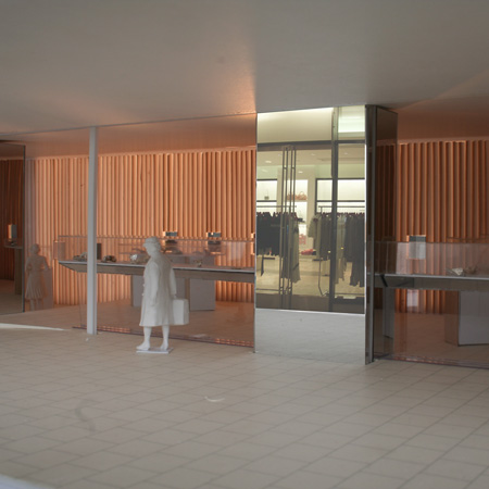
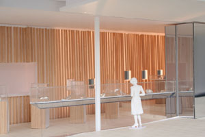
Branding is a very important issue for the brand companies. To emphasize their brand, one brand company uses the same design for all of the stores throughout the world. We began designing with the thought to follow the impression of Georg Jensen stores which is based on a tradition lasting more than 100 years. From our store visit in Sydney, Copenhagen and L.A., we found the following common attributes. They use the colors “Black and White” , “Wood”, and “Silver”. Silver is not used for the interior and is sometimes used for the color of the logo. We also can see silver as silversmiths in the stores.
Another idea is that we did not want to use these elements in an ordinary way. One linear wall is placed on the northern wall and it is composed with lattices having a square section. The four surfaces of the lattice are finished with four different elements. The lattices are rotatable, and can be fixed every 45 degrees, so eight different surfaces are possible. The Dynamic nature of this wall is that it can be visible in one color when viewed from the end of the wall when the lattice is set at 45 degrees. When the lattice is shown as one color, light comes though from the crevices between the lattices
世界各地に店を構え、創設から100年以上続く伝統的なジュエリーデザインの店舗は白と黒、木、シルバーといった材料が特徴的である。
壁一面に45度に傾いた角材の格子を設置し、角材のそれぞれの面を異なる素材で仕上げる。この格子が45度ずつ回転することによって8種類の壁になり、また一方向から見た場合は一つの色を見せる。ブランド企業にとって重要な色や素材を単純な仕掛けで多様な表情に換えた。
|